On the real test, Graph questions are presented as one or two statements with blanks in the statements; there are drop-down menus in the blanks to choose your answer.
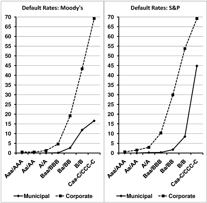
A scatterplot typically allows a comparison of different entities across two variables, those shown on the vertical and horizontal axes. In this case, however, since the points themselves are bubbles of varying size, this scatterplot is providing three pieces of information per data point. Read and map the prompt to sort out those three variables:
Sample map (yours will likely differ):
11 MLPs
Size of bubble: value (EV)
Horizontal: debt as % of EV; less is safer
Vertical: fee-based as % of revenue; more is safer
This graph allows the comparison of MLPs by their enterprise value (shown by the size of the bubbles) as well as by two dimensions of investor safety, shown on the two axes.
Statement 1: The map indicates that a lower proportion of debt and a higher proportion of fee-based revenue both correspond to greater safety. Debt percentage is on the horizontal axis, with safer values to the left, or "west." Fee-based revenue percentage is on the vertical axis, and safer values are higher up, or to the "north." Putting them together, bubbles to the northwest are the safest, while bubbles to the southeast are the least safe.
Without more detailed information about the measures of safety, the only way to be sure one MLP is safer than another is to find one that is safer according to both metrics. Are there any bubbles to the northwest of OKS? Yes, there are three, but only one appears as an answer choice: MMP. (Note: Because it completely encloses it, EPD is nearly as safe as OKS, but since the OKS bubble lies to the left of the center of EPD's bubble, OKS is slightly safer.)
The correct answer for the first blank is MMP.
Statement 2: The phrase in dollars suggests that some calculations (or estimations) will be required, since the information about debt is presented as a percentage of EV, not in dollars. The information about EV, however, is also not given in dollars, but is presented in relative terms by bubble size. Therefore, comparing MLPs by dollar amount of debt will mean comparing estimates of the shares of the bubbles' areas that are attributable to debt.
EEP's debt percentage is about 37%, or close to 3/8. Imagine slicing EEP's bubble like a pizza into eight slices; three of them are debt. Compare EEP to each of the answer choices to find one with more debt than EEP. An MLP with more debt than EEP will need either a larger EV, a larger debt percentage, or both. Estimate whenever possible to reduce the amount of work.
BPL and MMP both have lower EVs than EEP, with lower debt percentages, so their outstanding debts are definitely lower than EEP's. Likewise, OKS has a smaller debt percentage but with approximately the same EV. MMMP's debt percentage is slightly higher than EEP's, but its EV is significantly lower, so it has less debt than EEP as well.
KMP's bubble has nearly twice the diameter of EEP's, which means it has nearly four times the area, or four times the EV. Its debt percentage is only slightly lower than EEP's at approximately 32%, roughly 1/3. These estimates reveal that KMP's outstanding debt is probably larger than EEP's entire EV; it is 1/3 of a bubble that is nearly 4 times the size.
The correct answer for the second blank is KMP.